Cropper
Cropper
Since 8.6.0
Browser Support
- This component supports IE10+ and modern browsers.
Employment/Purpose
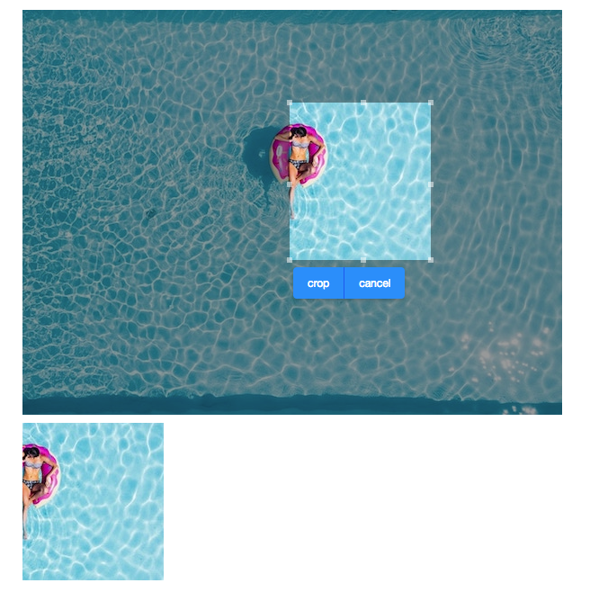
This component allows users to crop a selected range of image.
Example
<cropper x="50" y="100" w="100" h="100" onCrop="img.setContent(event.getMedia())" width="800px"
 toolbarVisible="true"  src="swimming-pool.jpg"/>
    <image id="img"/>
Properties and Features
Src
The src of the image.
Content
The content image.
AspectRatio
The width and height of the selected range will be fixed to the specified ratio.
MinWidth
The minimum width of the selected range.
MinHeight
The minimum height of the selected range.
MaxWidth
The maximum width of the selected range.
MaxHeight
The maximum height of the selected range
X
The left offset of the selected range.
Y
The top offset of the selected range.
W
The width of the selected range.
H
The height of the selected range.
ToolbarVisible
This component provides a built-in toolbar with Crop and Cancel buttons. You can make it invisible and create your UI control. Then call crop() and cancel() on your own.
CroppedFormat
Image formats like image/jpeg or image/png is allowed, Default is set to image/png
Supported Events
onChange |
Event: Event
Denotes user has resized the selected range. |
onChanging |
Event: Event
Denotes user is resizing the selected range. |
onCrop |
Event: UploadEvent
Denotes user has cropped the image. |
- Inherited Supported Events: HtmlBasedComponent
Supported Children
- NONE
Version History
| Version | Date | Content |
|---|---|---|
